

Overview
Dwolla’s drop-in components library allows developers to leverage isolated functions or build connected flows in their web applications, which expedites the integration process with the Dwolla Platform. Each component within Dwolla’s drop-in components library includes HTML, CSS and JavaScript that developers can drop-in and customize to fit the look and feel of their application. The library comes with a collection of low-code components that solve for a variety of functions and flows including: create a customer, document upload, balance display, as well as a connected flow for accepting incoming payments from a user. Each drop-in component contains built-in features such as responsive design, custom styling, error handling and more. These components allow developers to ship more with fewer lines of code— while improving readability and maintainability of their application’s code. This is a language-agnostic library, meaning that any webpage that supports client-side JavaScript will support drop-in components! For ease of use, however, we also offer JSX/TSX bindings if you are developing using React or a React-based environment (such as Next). As the library continues to grow, Dwolla will evaluate adding support for other frameworks based on community feedback.Workflow
Use of Dwolla’s drop-in components requires client-side and server-side interaction between your application and Dwolla. A unique “client token” is generated with limited permissions to be used in the components library to authenticate requests to Dwolla.1
Initialize Components
On your application’s front-end, the Dwolla components library is instantiated and configured. One or many components are dropped into the web page where they will be rendered.
2
Request Client Token
A request is sent from your front-end to your back-end server to generate a client-token. Using a server-side SDK, you’ll specify the “action” needed for the component and the unique Customer ID that represents the end user performing the action.
3
Authenticate with Client Token
Your server sends the generated client token back to your front-end which is used by the components library to authenticate the client-side request to Dwolla.
4
User Interaction
Your end user interacts with the Dwolla Component, either directly via submission of information in a form (e.g. upgrade customer), or indirectly by viewing data (e.g. balance display).
Drop-in Component Example
Dwolla’s drop-in components are customizable to match the look and feel of your application down to the individual HTML element by applying styles via custom CSS classes. Preview the Unverified Customer component below, or refer to the drop-ins examples repo to view a list of all drop-in component examples.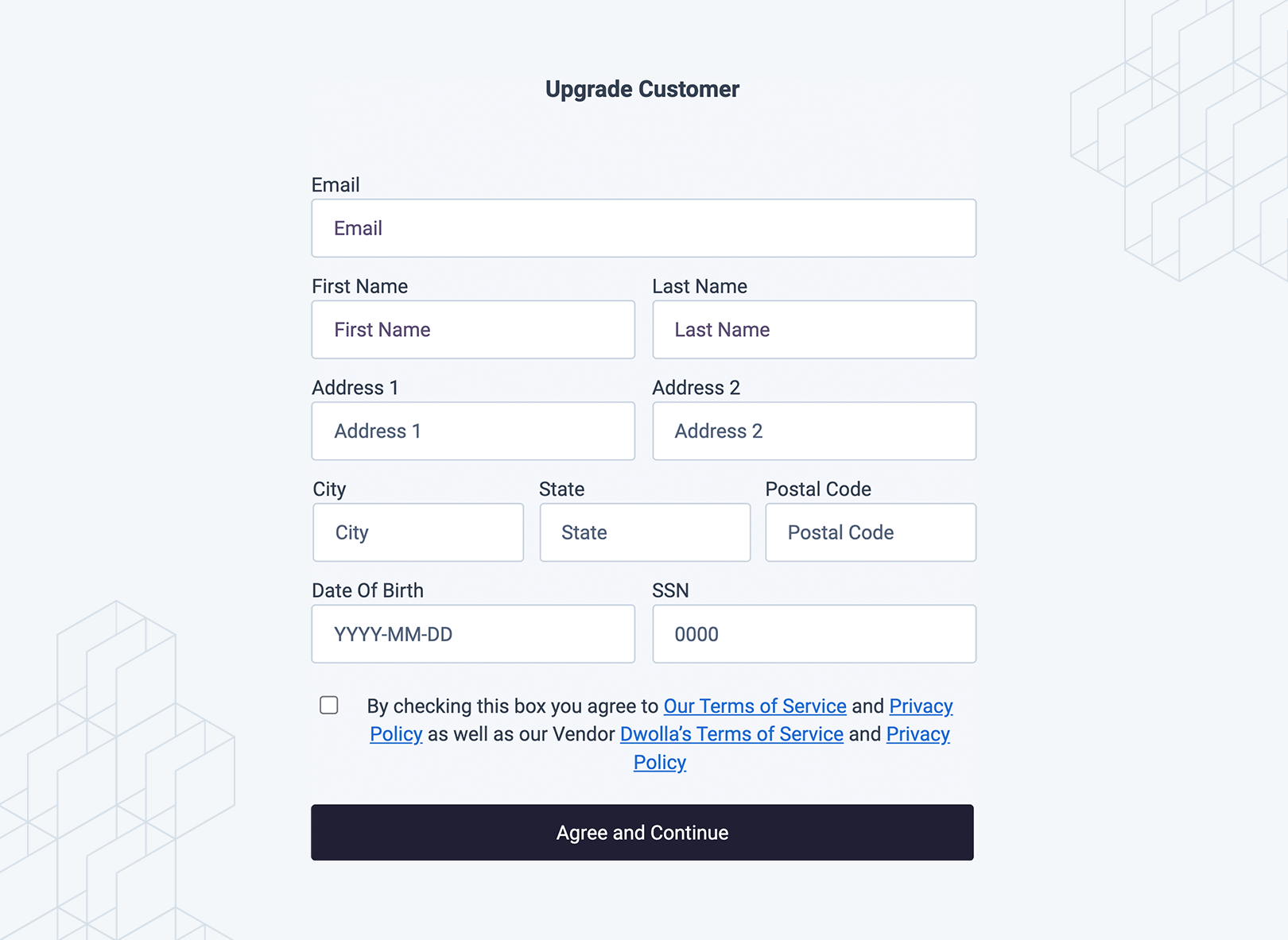
Setup
Every component shares the same one-time setup: loaddwolla-web.js, then call dwolla.configure({ ... }). The tokenUrl you provide points at your own back-end proxy, which mints the scoped client token each component needs. Because the proxy handles token generation, you don’t need to specify individual client-token actions per component.
Supported Components
Dwolla’s UI components library contains a variety of supported components that represent isolated functions or connected flows. This section outlines the complete list of supported components. For each component you’ll find a description of when to use it, its HTML tag, configurable attributes, CSS classes for customization, and a preview.Drop-in Components Guide
For more information on integrating drop-in components, reference our Guide which walks through how to use drop-in components in full detail.
Create a Receive Only User
dwolla-customer-create
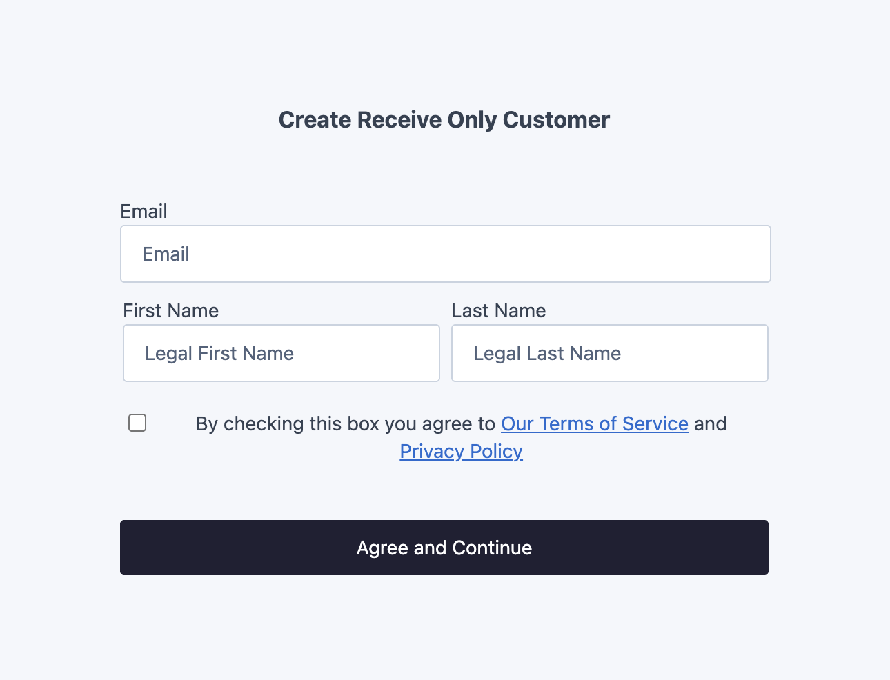
Renders a form that collects the information needed to create a Receive Only user (type="receive-only"). Receive Only users are restricted to a payouts-only funds flow. Use this when you need to pay out to a recipient who won’t send funds on your platform. To learn more about this customer type, visit our docs on concepts.
Usage
This assumes you’ve already calleddwolla.configure({ ... }) once during setup.
Full HTML page example
Full HTML page example
Attributes
View all required vs. optional parameters in our API Reference.
CSS classes for customization
CSS classes for customization
Preview
Preview
Create an Unverified Customer
dwolla-customer-create
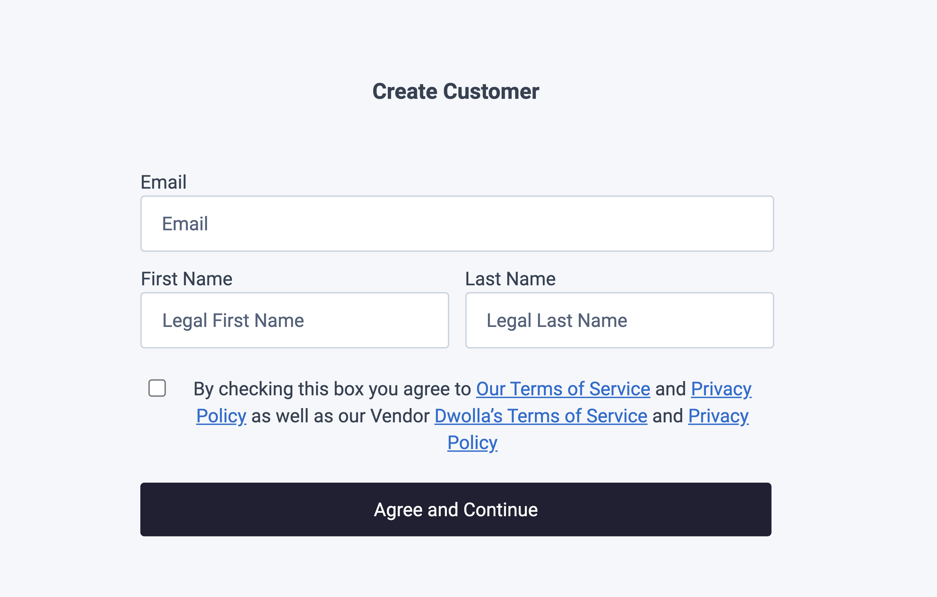
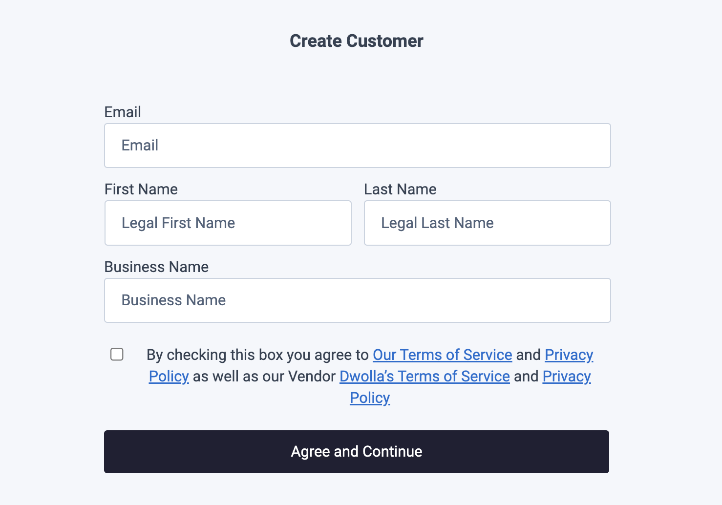
Renders a form that collects the minimal information needed to create an Unverified Customer: first name, last name, email, and optionally a business name. Add the isBusiness attribute to prompt for a business name. Use this for the lightest-weight customer record; you can upgrade them to a Verified Customer later. To find out more about the abilities and limitations of this customer type, visit our docs on concepts.
Usage
This assumes you’ve already calleddwolla.configure({ ... }) once during setup.
Full HTML page example
Full HTML page example
Attributes
View all required vs. optional parameters in our API Reference.
CSS classes for customization
CSS classes for customization
Preview
Preview
Upgrade an Unverified Customer
dwolla-customer-update
Renders a form that upgrades an existing Unverified Customer into a Personal Verified Customer, giving them higher transaction limits and the ability to hold a balance. Use this when a customer who started out unverified is ready to be fully verified. For more information on the difference between an Unverified and Verified Customer, visit our docs on concepts.
Usage
This assumes you’ve already calleddwolla.configure({ ... }) once during setup.
Full HTML page example
Full HTML page example
Attributes
View all required vs. optional parameters in our API Reference.
CSS classes for customization
CSS classes for customization
Preview
Preview
Create a Personal Verified Customer
dwolla-personal-vcr
Renders a form that collects the information needed to create a Personal Verified Customer — an individual who can send, receive, and hold a Dwolla balance. Use this to onboard a fully verified individual directly, without first creating an Unverified Customer and upgrading later. To learn more about the different customer types, visit our docs on concepts.
Usage
This assumes you’ve already calleddwolla.configure({ ... }) once during setup.
Full HTML page example
Full HTML page example
Attributes
View all required vs. optional parameters in our API Reference.
Update, retry, or upload documents
Thedwolla-personal-vcr component isn’t limited to creating a new customer — pass an existing customer’s customerId and the component checks their current verification status and renders the right flow:
retry— displays a form so the customer can correct and resubmit their identifying information.document— presents the document upload flow so the customer can upload an identifying document to complete verification.
CSS classes for customization
CSS classes for customization
Preview
Preview
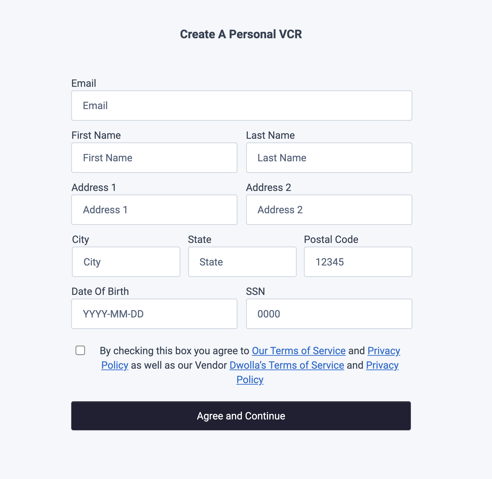
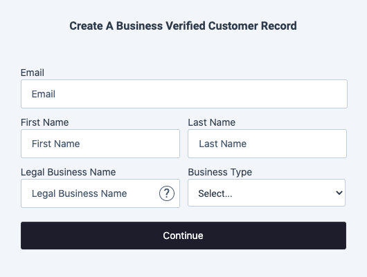
Create a Business Verified Customer
dwolla-business-vcr
Renders a form that collects the information needed to create a Business Verified Customer. Business Verified Customers can send and receive funds, hold a Dwolla balance, and have a transfer limit of $10,000 per transfer. Use this to onboard a business entity. To learn more about the different customer types, visit our docs on concepts.
Usage
This assumes you’ve already calleddwolla.configure({ ... }) once during setup.
Full HTML page example
Full HTML page example
Attributes
View all required vs. optional parameters in our API Reference.
Update, retry, or upload documents for a business customer
Like the Personal VCR component, thedwolla-business-vcr component can be reused for an existing customer — pass their customerId and the component checks the current verification status and renders the right flow:
retry— displays a form so the customer can correct and resubmit the business and controller information.document— presents the document upload flow so the customer can upload the required identifying document(s) to complete verification.
CSS classes for customization
CSS classes for customization
Preview
Preview
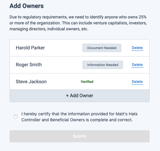
Create Beneficial Owners
dwolla-beneficial-owners
Renders a form that collects the information needed to add Beneficial Owners after a Business Verified Customer has been created. Use this to certify beneficial ownership; it can be paired with the Business Verified Customer component or used on its own. To learn more about the different customer types, visit our docs on concepts.
Usage
This assumes you’ve already calleddwolla.configure({ ... }) once during setup.
Full HTML page example
Full HTML page example
Attributes
View all required vs. optional parameters in our API Reference.
CSS classes for customization
CSS classes for customization
Preview
Preview
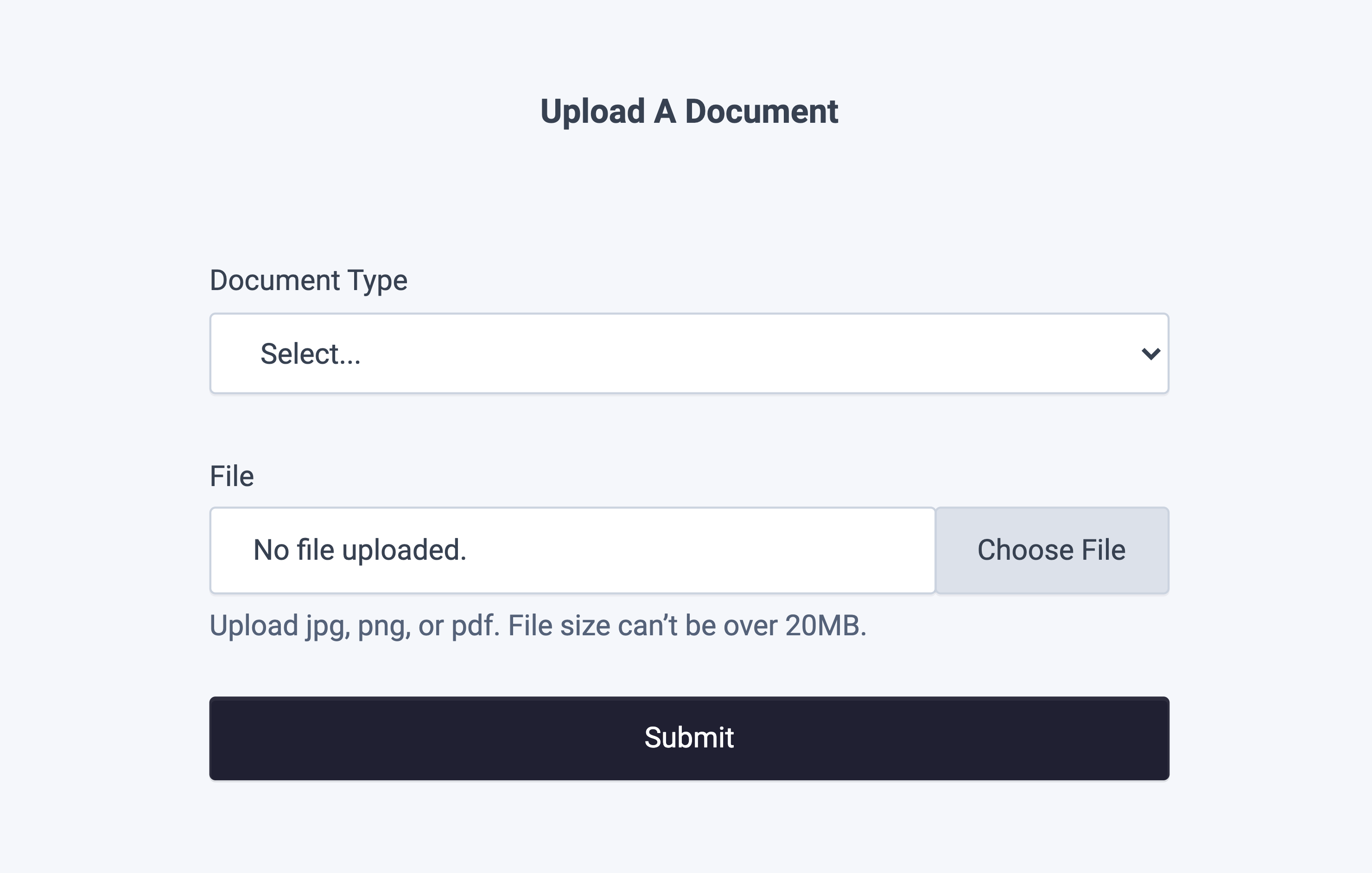
Document Upload
dwolla-document-upload
Renders a document upload form for a Verified Customer or Beneficial Owner who has a document status and needs to upload an identifying document to complete verification. Use this when a government-issued document is required to verify an individual or business’s identity.
Usage
This assumes you’ve already calleddwolla.configure({ ... }) once during setup.
Full HTML page example
Full HTML page example
Attributes
View all required vs. optional parameters in our API Reference.
CSS classes for customization
CSS classes for customization
Preview
Preview
Create a Funding Source
dwolla-funding-source-create
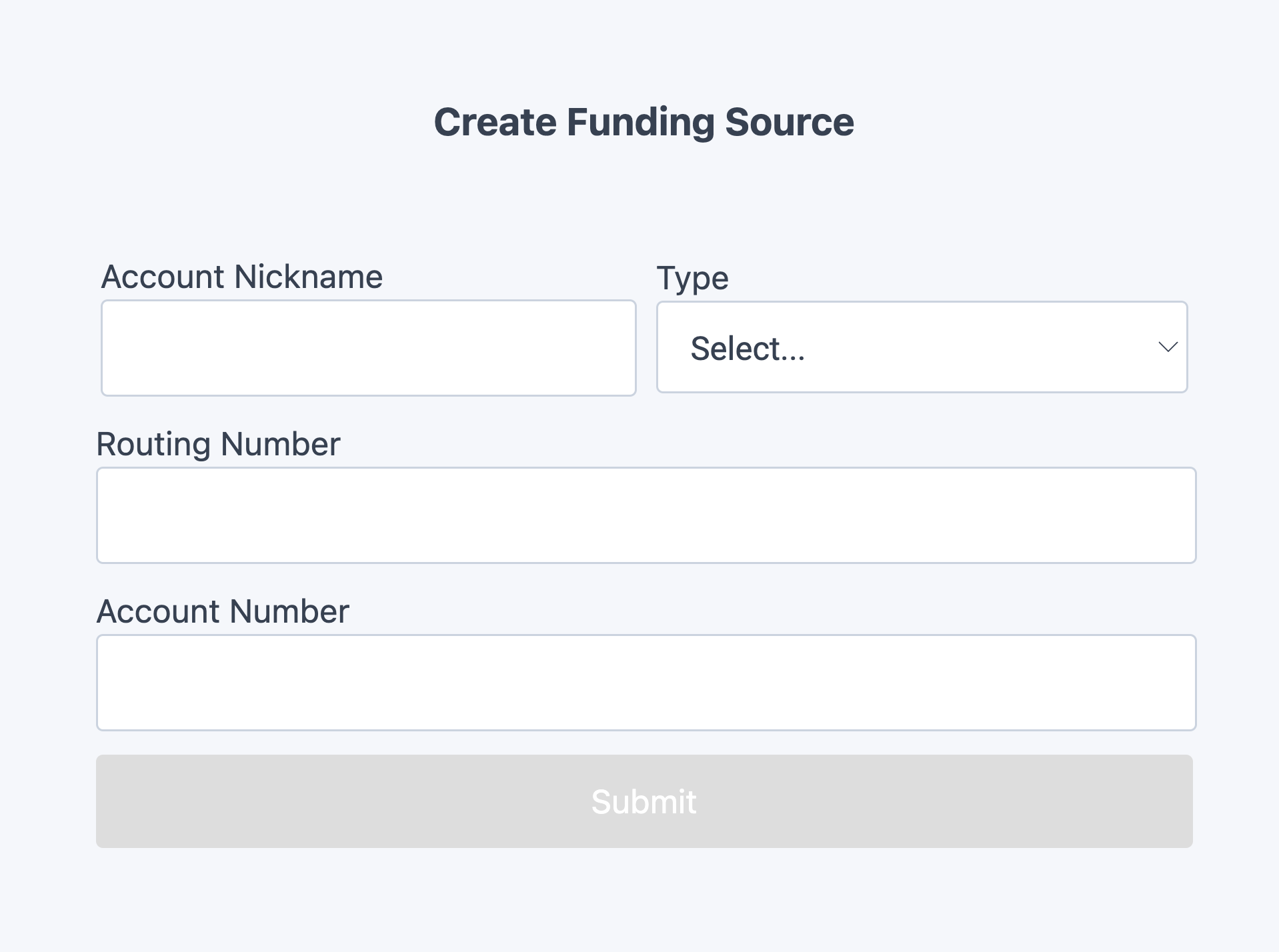
Renders a form that collects the information needed to create a bank funding source attached to a customer record. Optionally, add the initiateMicroDeposits attribute to automatically initiate micro-deposits when the funding source is created.
Usage
This assumes you’ve already calleddwolla.configure({ ... }) once during setup.
Full HTML page example
Full HTML page example
Attributes
View all required vs. optional parameters in our API Reference.
CSS classes for customization
CSS classes for customization
Preview
Preview
Verify Micro Deposits
dwolla-micro-deposits-verify
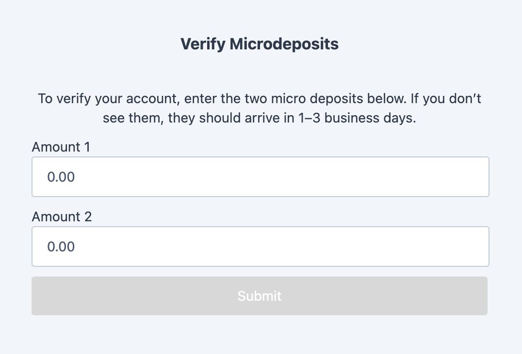
Renders a form that collects the micro-deposit amounts needed to verify a customer’s bank funding source. Present this component once micro-deposits have successfully posted into the customer’s bank funding source. Check out our guide on verifying a bank with micro-deposits for more information.
Usage
This assumes you’ve already calleddwolla.configure({ ... }) once during setup.
Full HTML page example
Full HTML page example
Attributes
CSS classes for customization
CSS classes for customization
Preview
Preview
Display a Verified Customer’s Balance
dwolla-balance-display
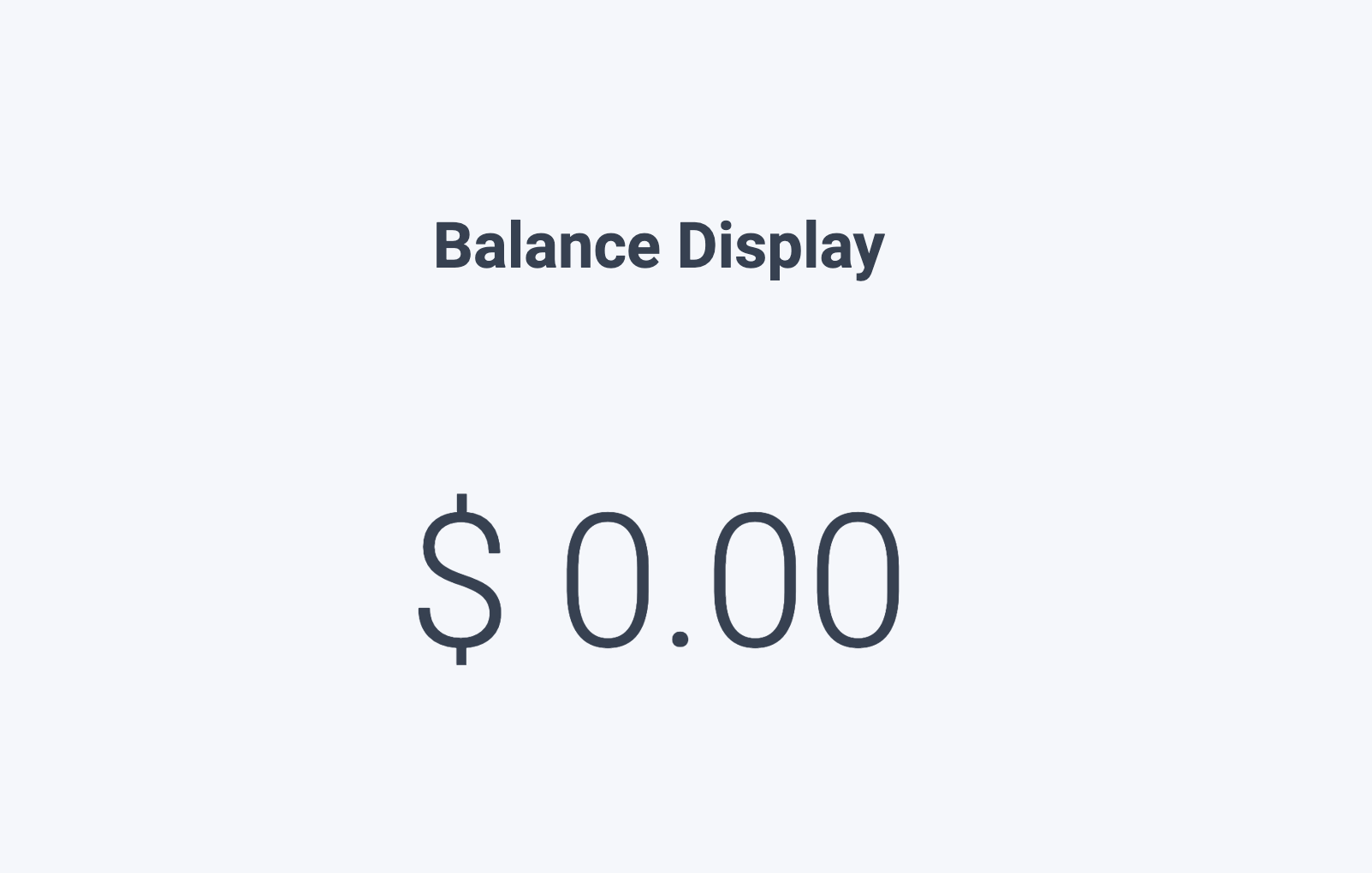
Displays the Dwolla balance for a customer who already has one — a Personal Verified Customer or a Business Verified Customer. Add the hideZeroBalance attribute to suppress the display when the balance is $0.00.
Usage
This assumes you’ve already calleddwolla.configure({ ... }) once during setup.
Full HTML page example
Full HTML page example
Attributes
CSS classes for customization
CSS classes for customization
Preview
Preview
Pay-In
dwolla-payin
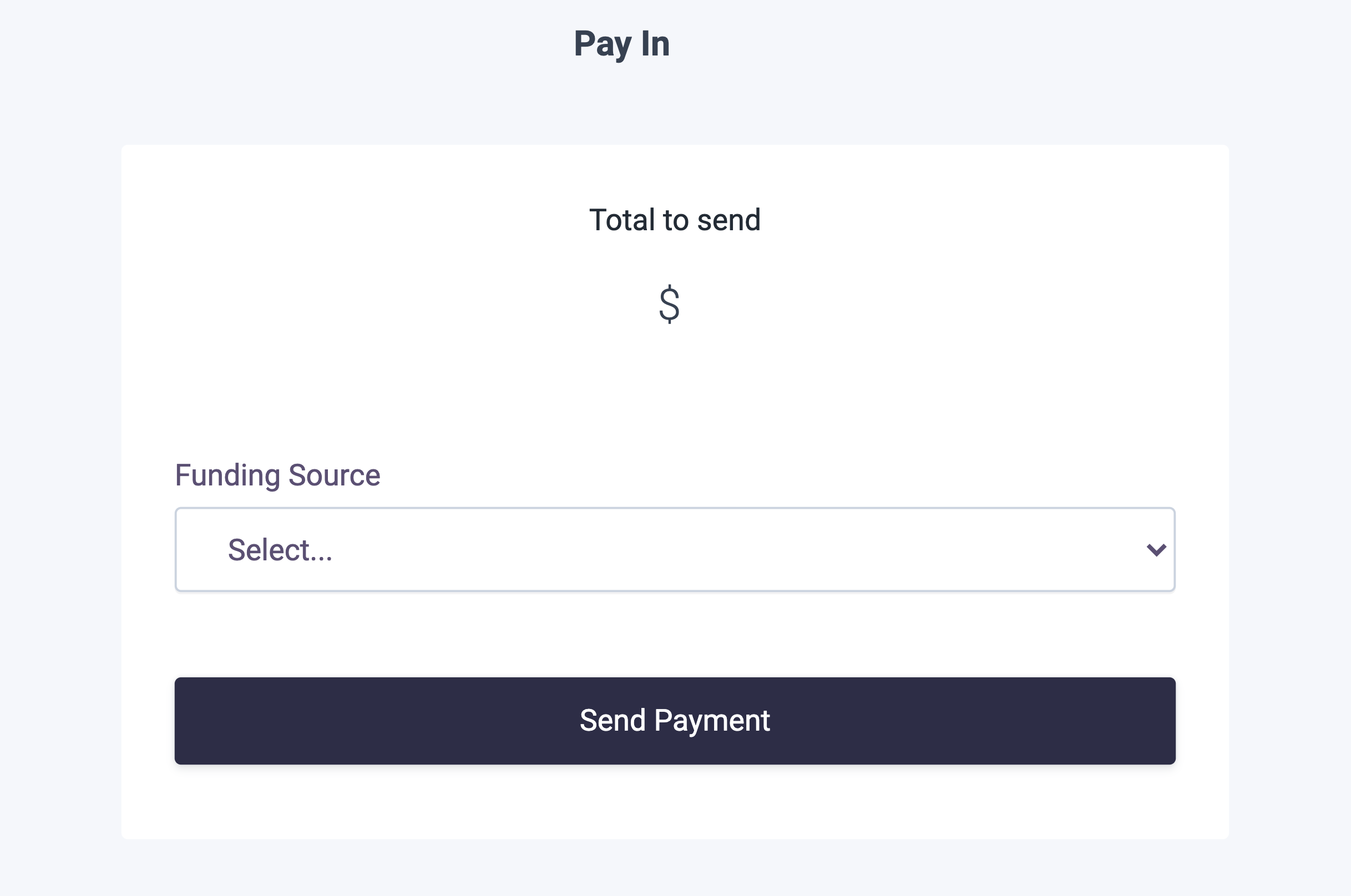
Renders a connected flow for transferring funds from a customer’s verified funding source into your own Dwolla Client funding source. The customer can be an Unverified, Personal Verified, or Business Verified Customer, and must already have a verified funding source.
To add and verify a funding source, you can:
- Add a bank with an account and routing number, then verify it with micro-deposits
- Add and verify a bank with Open Banking
Usage
This assumes you’ve already calleddwolla.configure({ ... }) once during setup.
Full HTML page example
Full HTML page example
Attributes
CSS classes for customization
CSS classes for customization
Preview
Preview
Next steps
Leveraging Dwolla’s UI Components library is a great way to expedite your integration with the Dwolla Platform by limiting the amount of custom code that you would be required to write. Get started building with drop-in components by checking out the getting started guide and the API Reference documentation.Changelog
v3.1.0 (Latest)
The latest version of dwolla-web.js is 3.1.0. If you are currently using an earlier version, we recommend upgrading to v3.1.0.
- Enhanced multi-document verification for Business Verified Customers in the
<dwolla-business-vcr>drop-in component.- Expanded support for “Doing Business As” (DBA) and combined controller and business document flows, so the upload UI presents all required document type options.
- Improved verification tracking to evaluate each document by type against the customer’s live status after every upload, so accepted documents no longer re-prompt and pending ones are not re-requested.
- Added an uploaded-documents summary showing each document’s type, verification status, and any failure reasons.
- Added DBA-specific guidance when a “Doing Business As” document is requested.
v3.0.0
- BREAKING: Added mandatory Terms of Service and Privacy Policy acceptance checkbox for Receive-Only customers in
<dwolla-customer-create>drop-in component.- The
type="receive-only"attribute now requirestermsandprivacyattributes to be provided. - Users must accept the Terms of Service and Privacy Policy before creating a Receive-Only customer (required for regulatory compliance).
- Receive-Only customers display client’s Terms of Service and Privacy Policy (not Dwolla’s).
- The
- Fixed duplicate
idattributes in checkbox inputs across multiple drop-in components.
v2.2.2
- Updated user hints and prompts for documentation upload screens to be correct and consistent throughout the following drop-in components:
<dwolla-beneficial-owners><dwolla-business-vcr><dwolla-document-upload><dwolla-personal-vcr>
v2.2.1
- Renamed
Namefield toAccount Nicknamein<dwolla-funding-source-create>drop-in for clarity.
v2.2.0
- Added
<dwolla-funding-source-create>drop-in component. - Added
<dwolla-micro-deposits-verify>drop-in component. - Updated
dwolla.configuretokencallback function to receive{ _links, action, links }, rather than just{ action, links }. This will allow immediate pass-through without modification to the Dwolla API while maintaining backwards compatibility for existing implementations. - Made
postalCodeoptional in<dwolla-business-vcr>drop-in for Business Verified Customers with non-US controllers.
v2.1.9
- Fixed
Submitbutton double-click issue on customer creation drop-ins. - Improve SSN field validation.
- Added optional
hideZeroBalanceattribute to<dwolla-balance-display>drop-in. - Added new Account Opening drop-in
<dwolla-account-opening>.
v2.1.8
- Added optional
correlationIdfield to<dwolla-customer-create>,<dwolla-business-vcr>and<dwolla-personal-vcr>drop-ins. - Added optional
businessNamefield to<dwolla-customer-create>drop-in. - Added optional
hideDBAFieldattribute to<dwolla-business-vcr>drop-in. - Made
EINoptional in the<dwolla-business-vcr>drop-in for Business Verified Customers of type Sole Proprietorship. - All components are now flow-type components requiring multiple calls to the
client-tokensendpoint for granularly scoped actions. - Implemented hard-versioning of dwolla-web.js; to use the latest version, you will need to import the exact version rather than just the major version using the CDN script.
v2.1.6
- Changed
successcallback response structure. In previous versions, upon successful creation of a resource, thelocationof the newly created resource is returned. In v2.1.6 and onwards, the success JSON response will contain a top-levelresourceand aresponseobject with the location to the newly created resource.